
GOODBODY CLIENT
GOODBODY CLIENT
GOODBODY CLIENT
...
//////////////////////////////
BRIEF
Work as a team and produce a unified set of marketing material designed to inform young adults about Goodbody, focusing specifically on the hemp plant (Cannabis sativa), CBD, and the Endocannabinoid system. Additionally, emphasize its main uses as a pain relief rather than the misconception of association with THC.
DELIVERABLES
•Simple Educational guide
•Printable Info graphic
•Social media campaign
•Animated digital signage slides
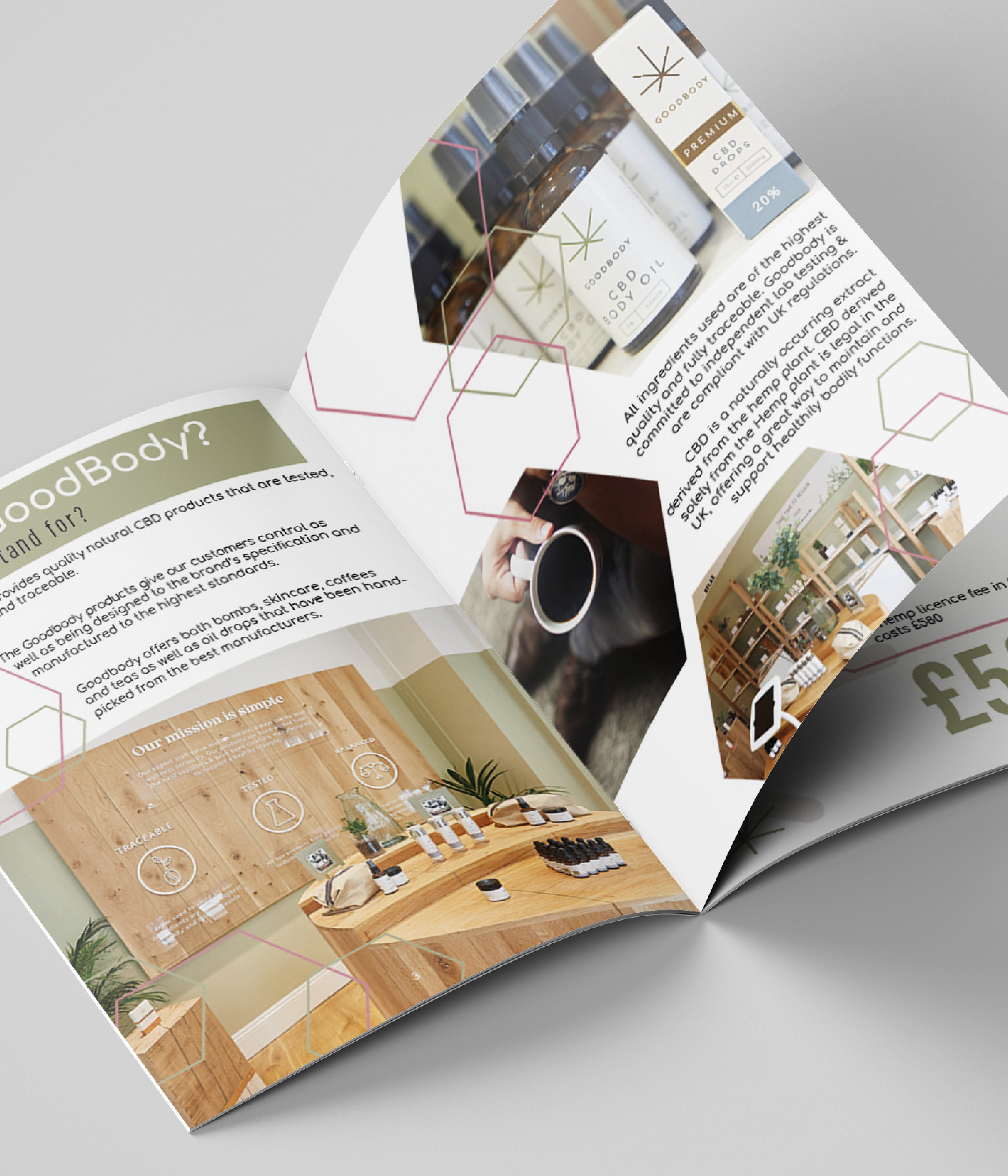
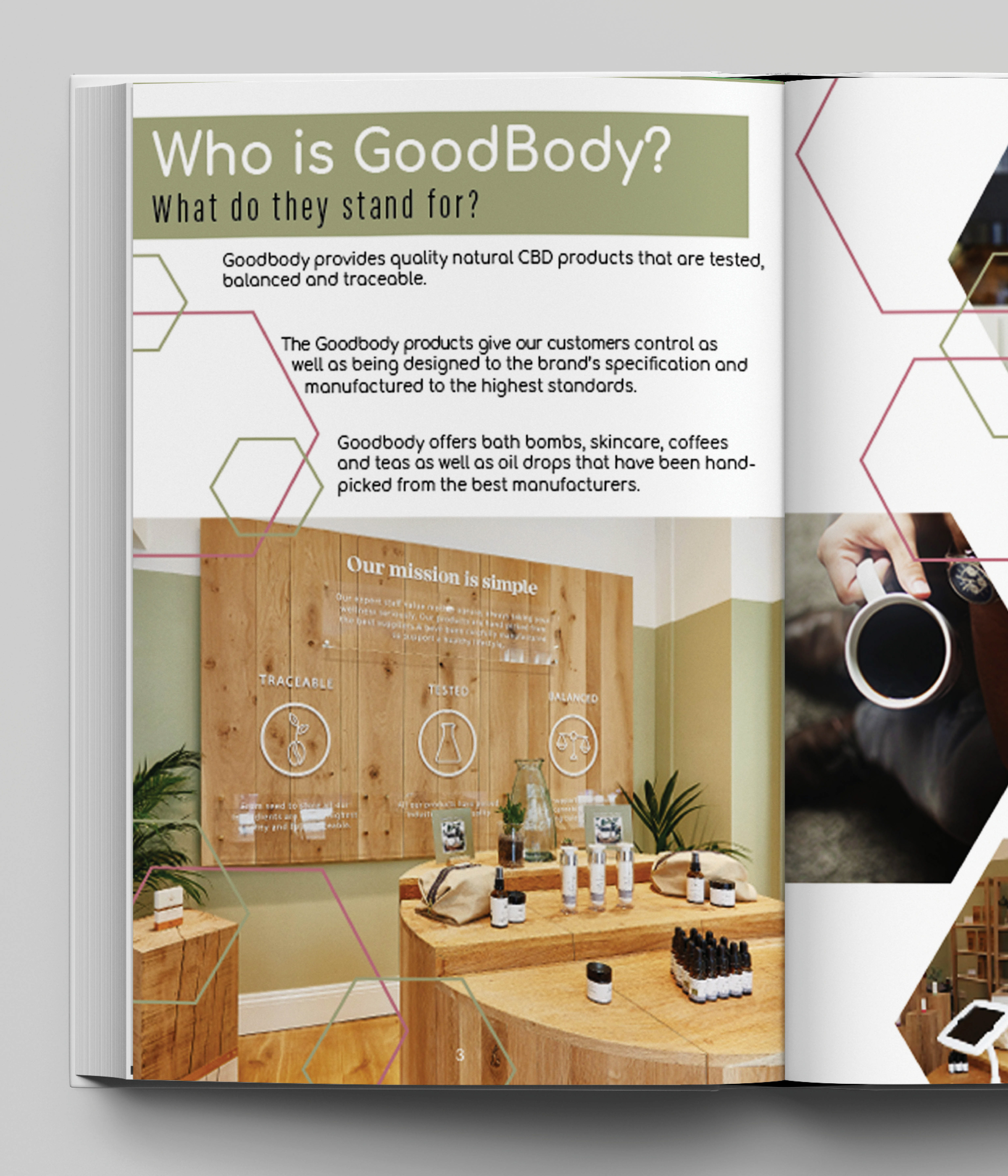

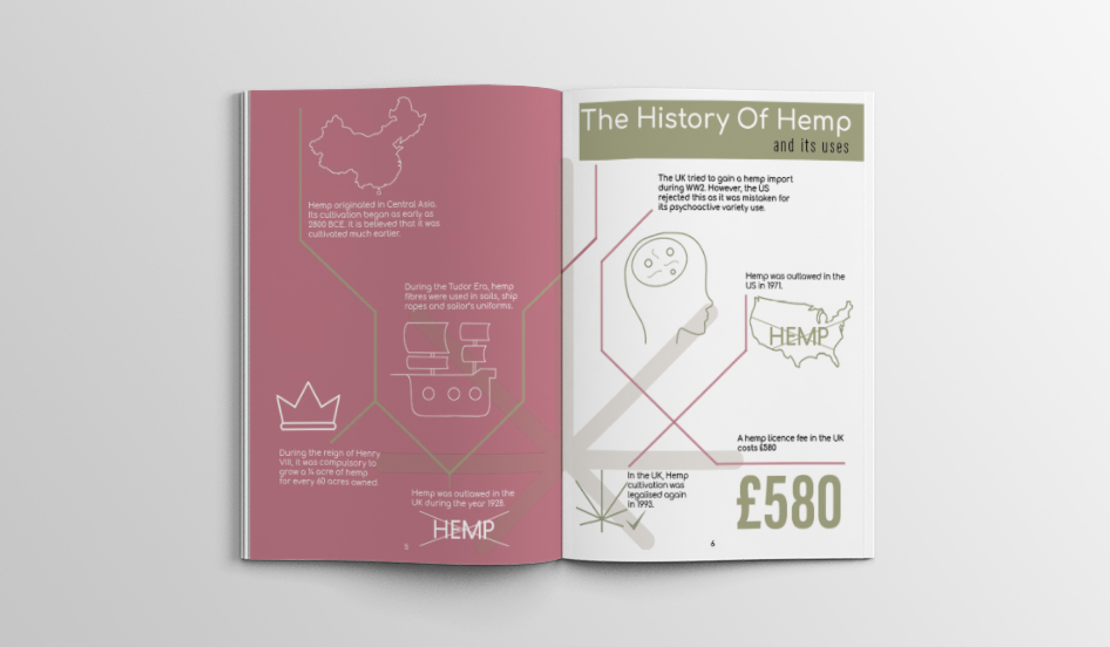
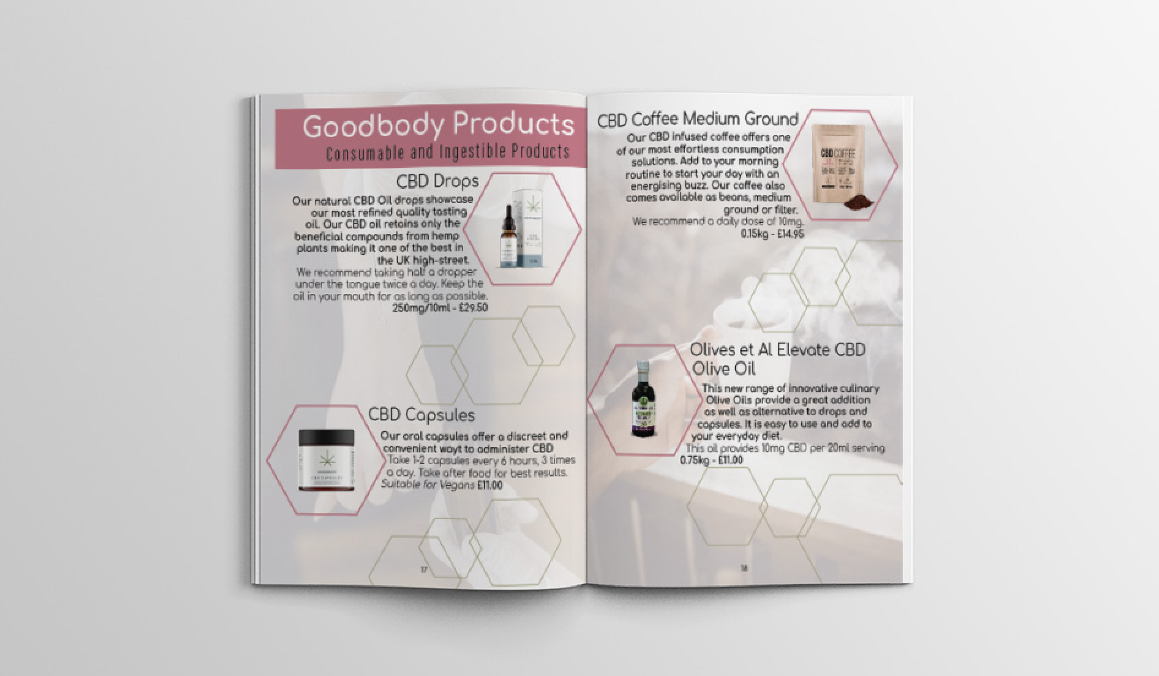
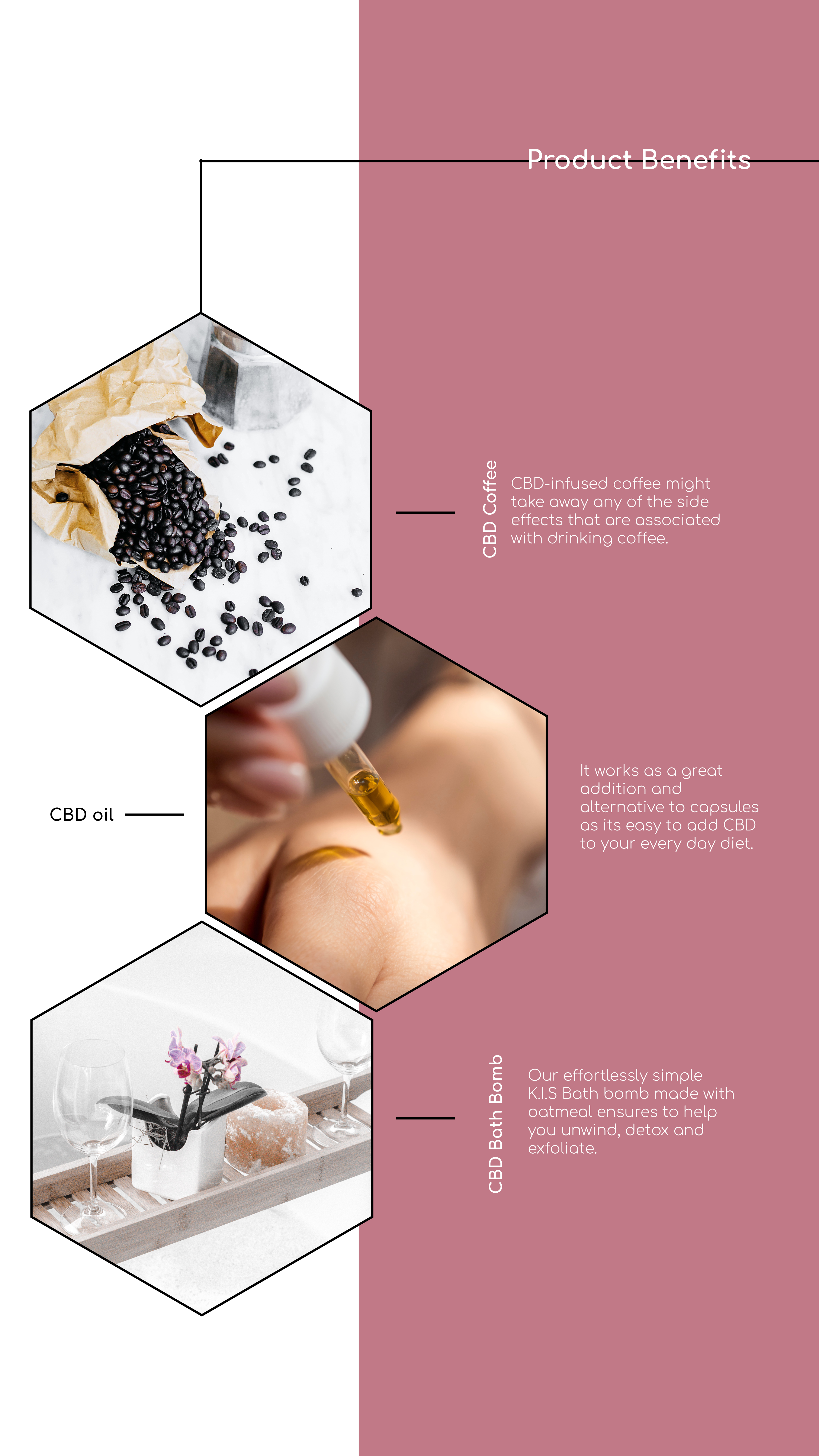
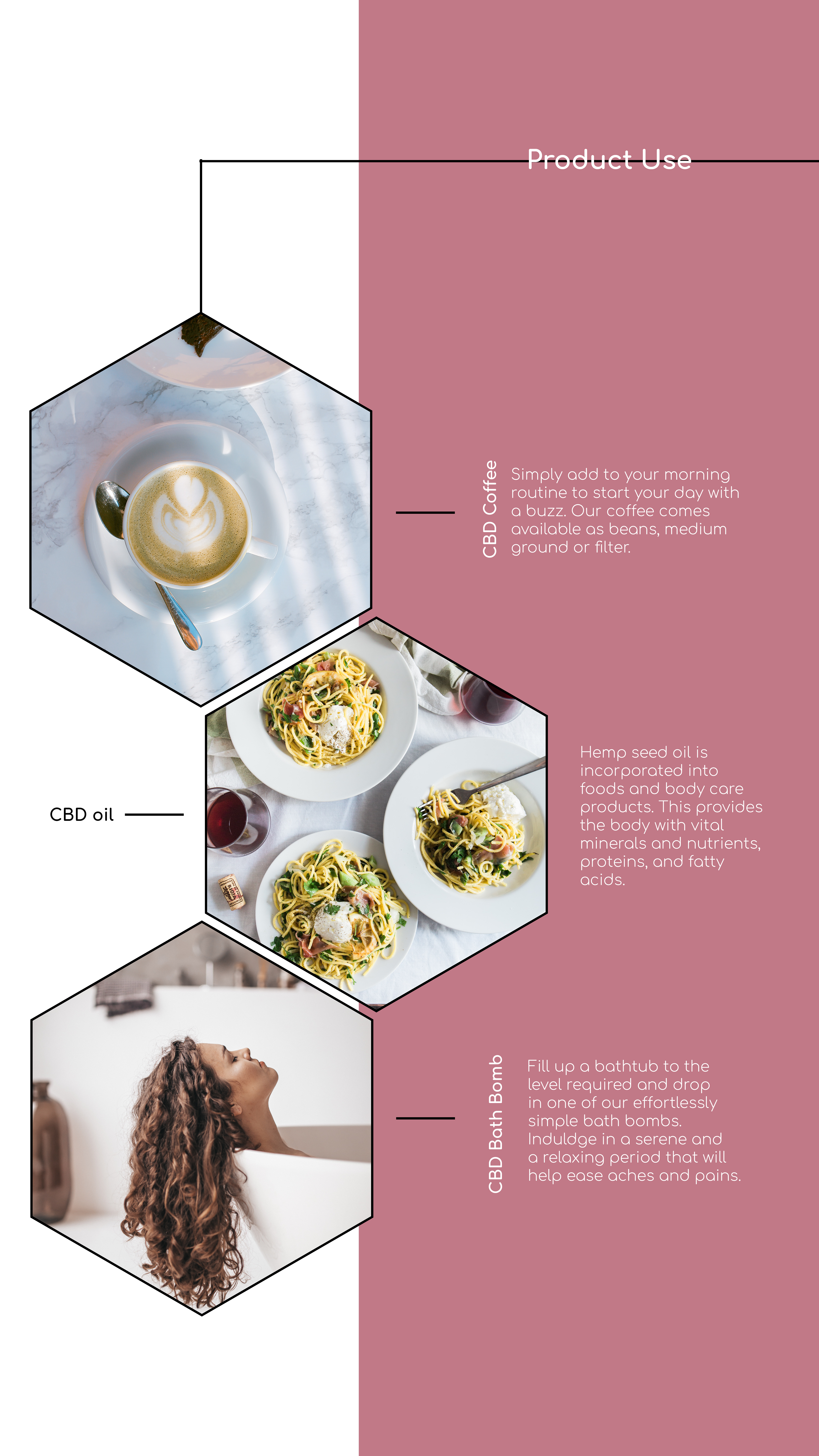
EDUCATIONAL GUIDE
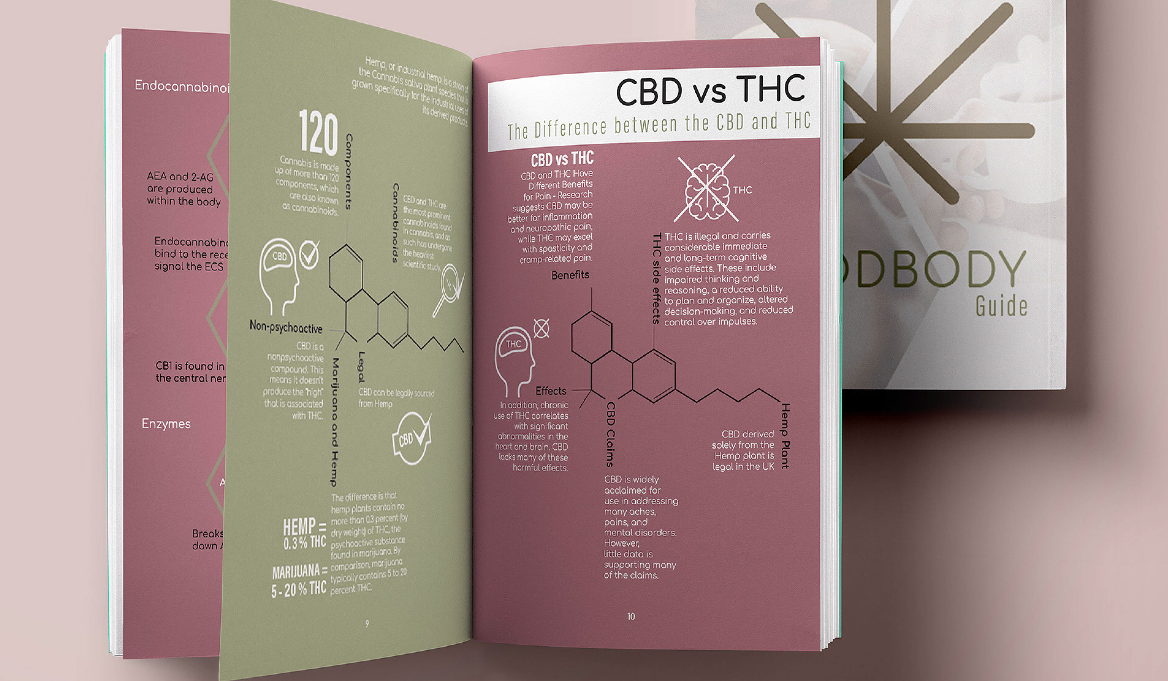
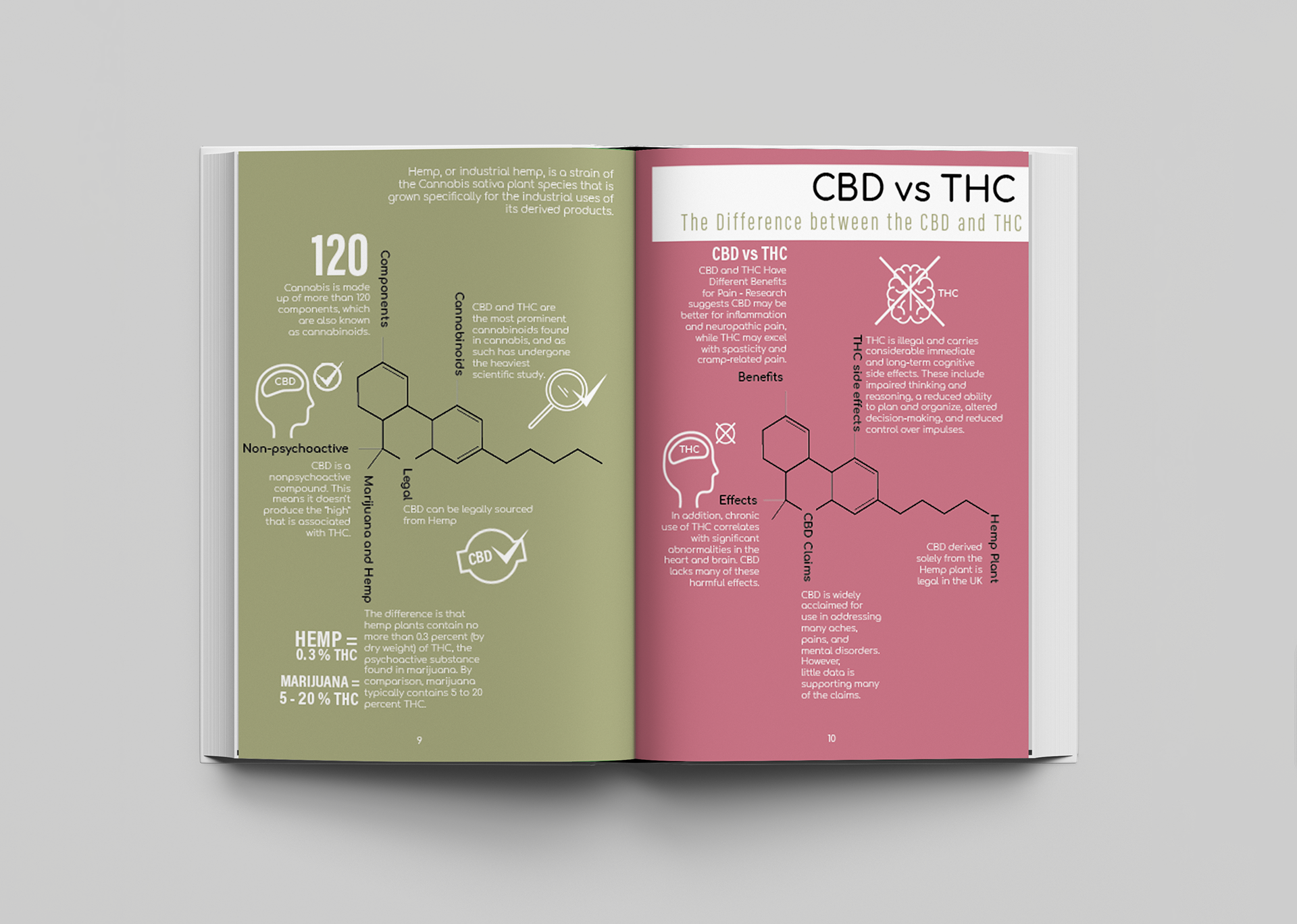
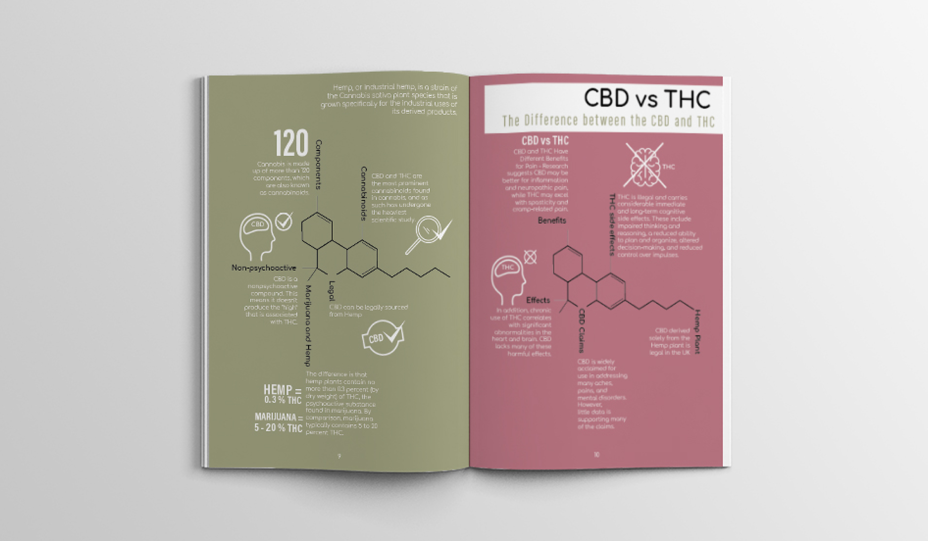
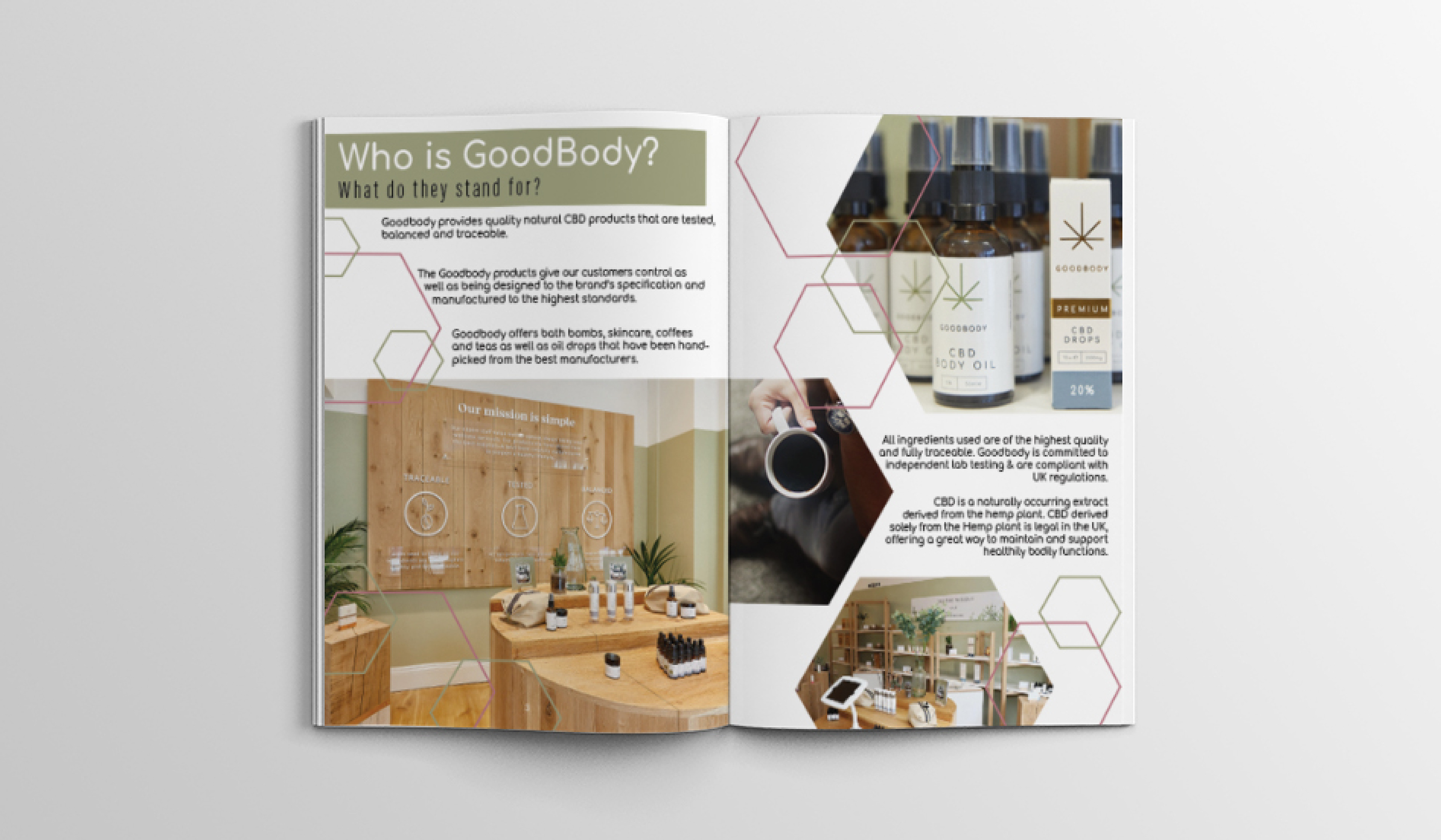
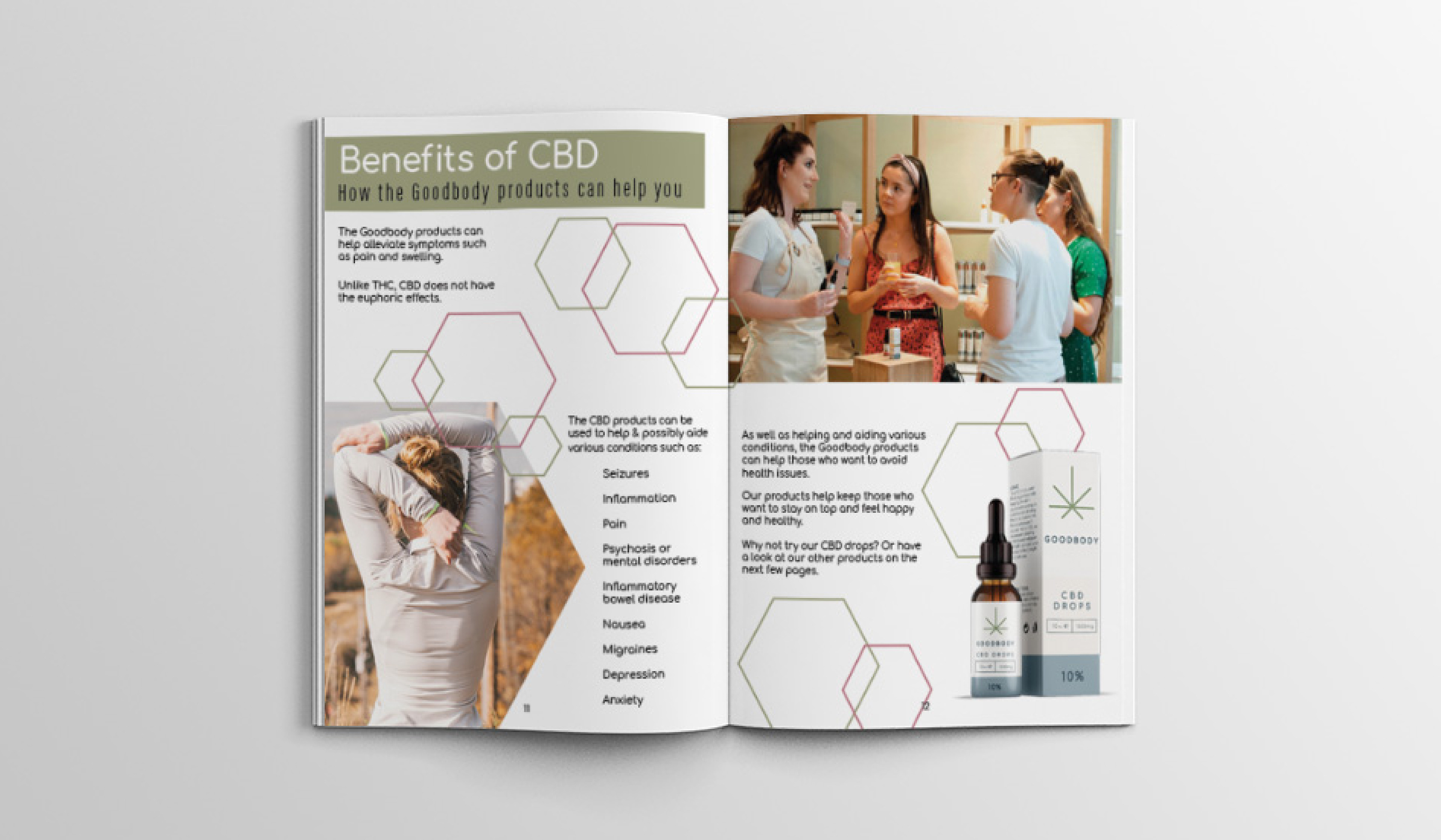
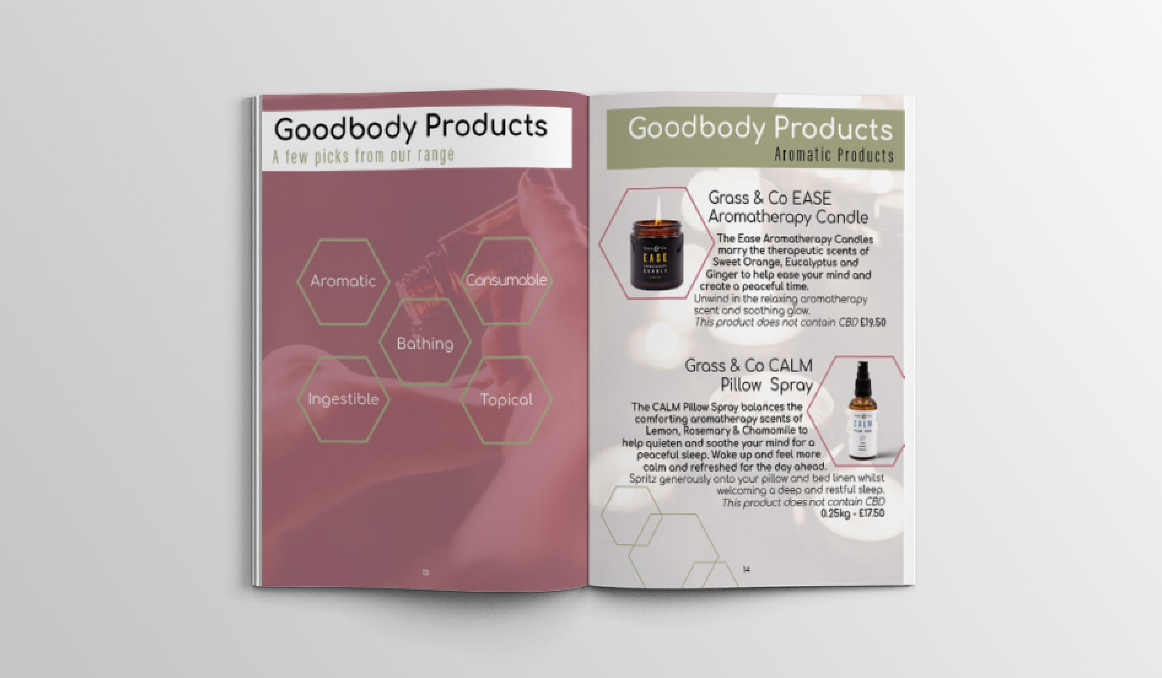
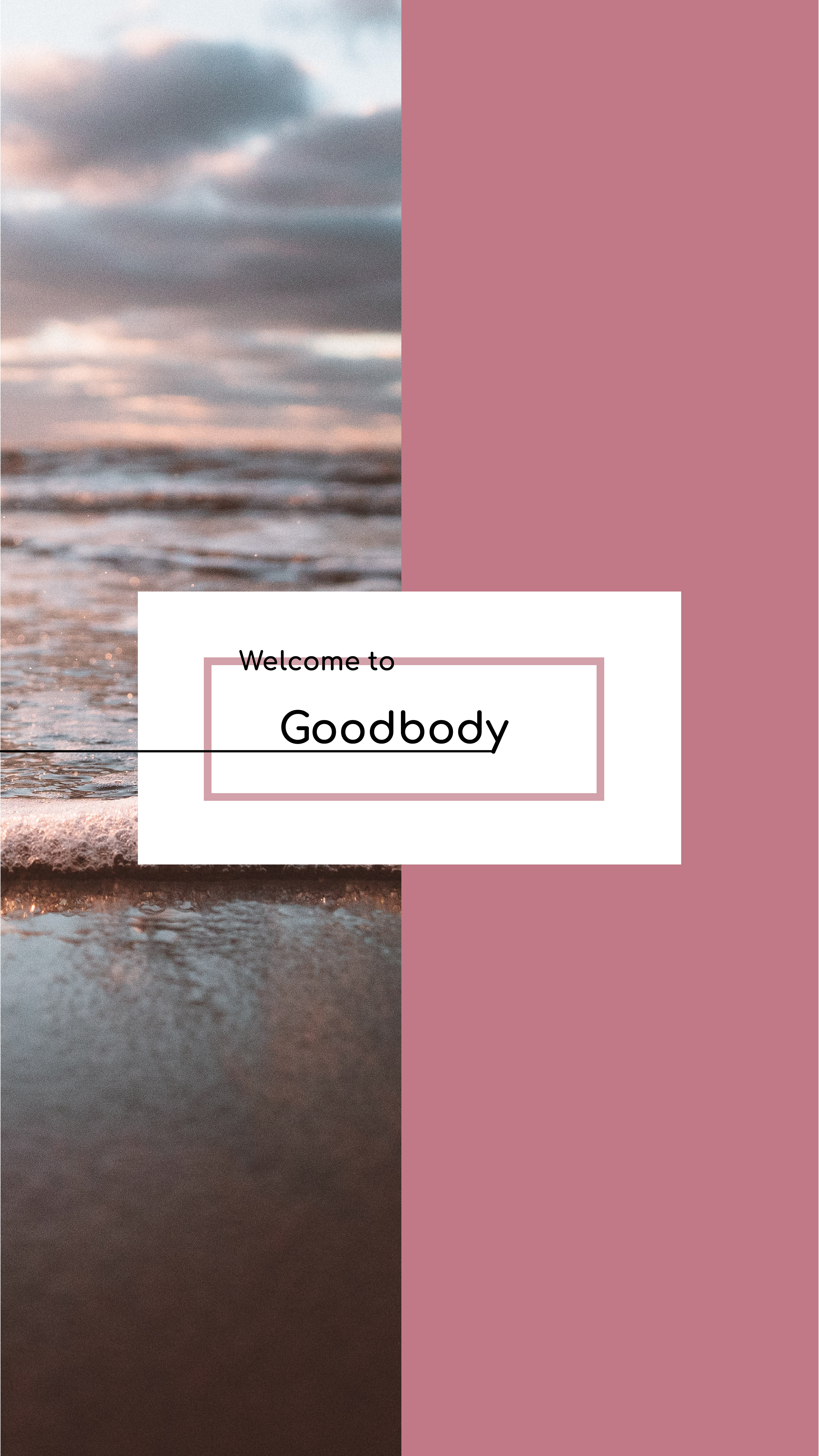
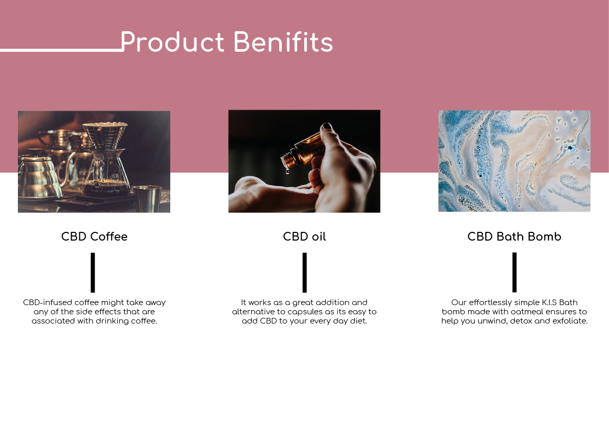
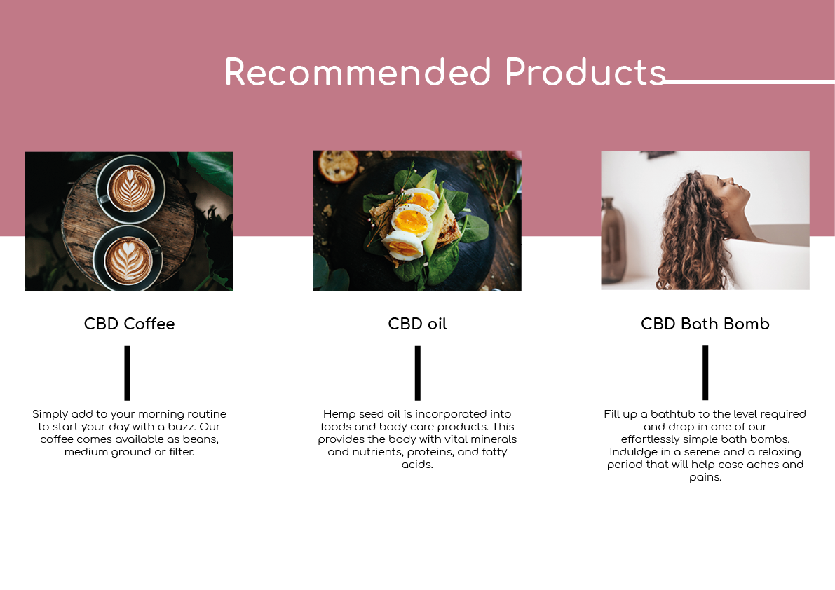
The design centered around the CBD molecule, fostering trust and aligning with our brand's principles of trustworthiness and knowledgeably. To dismiss cannabis misconceptions, we chose a soft pink, complementing the main brand color while maintaining the feeling of trust.
Typesetting remains consistent, per the client's request.
Typesetting remains consistent, per the client's request.
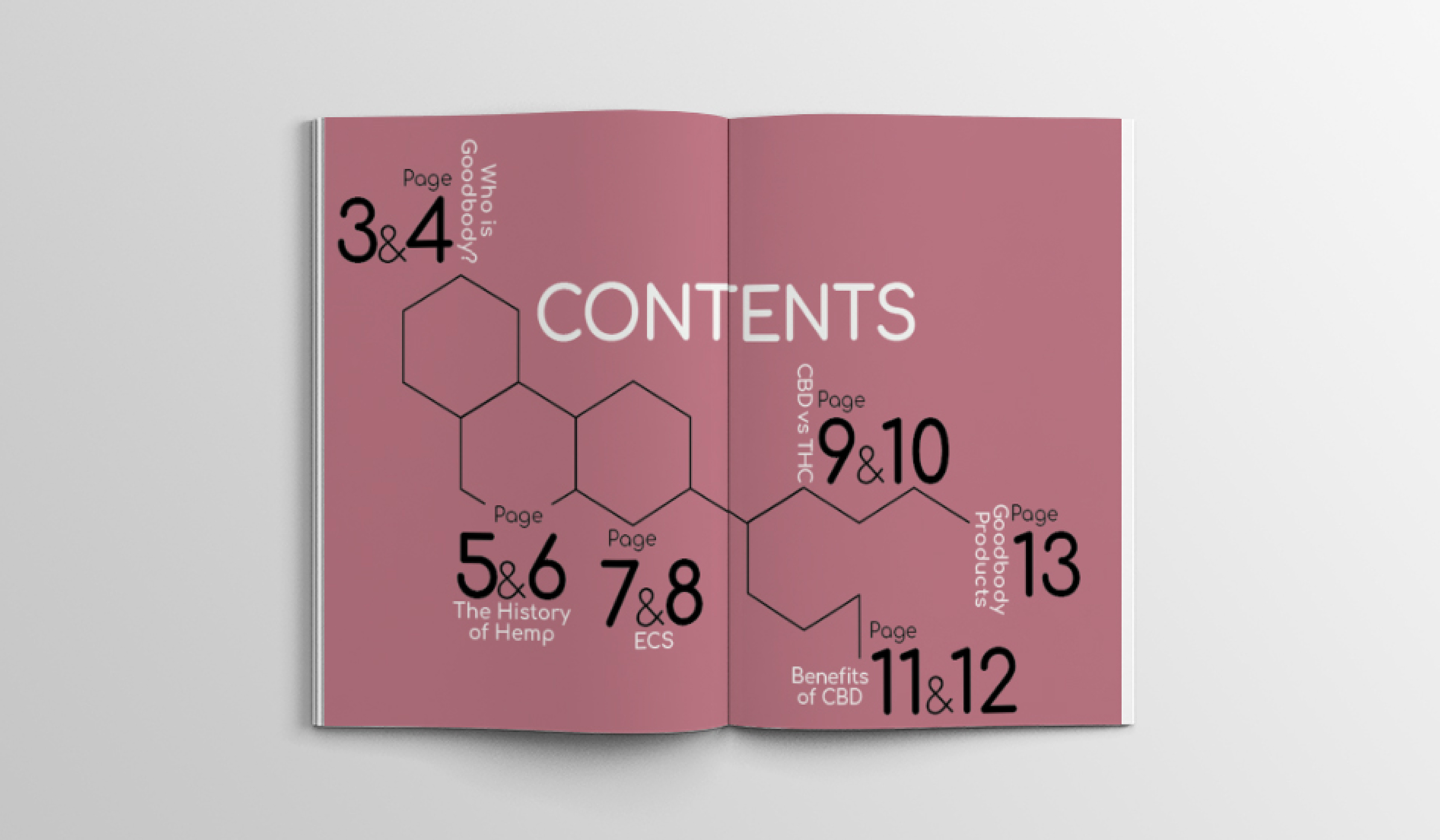
The guide was a group effort, but I designed the 'Contents page' as well as the double page spread called 'CBD vs THC'
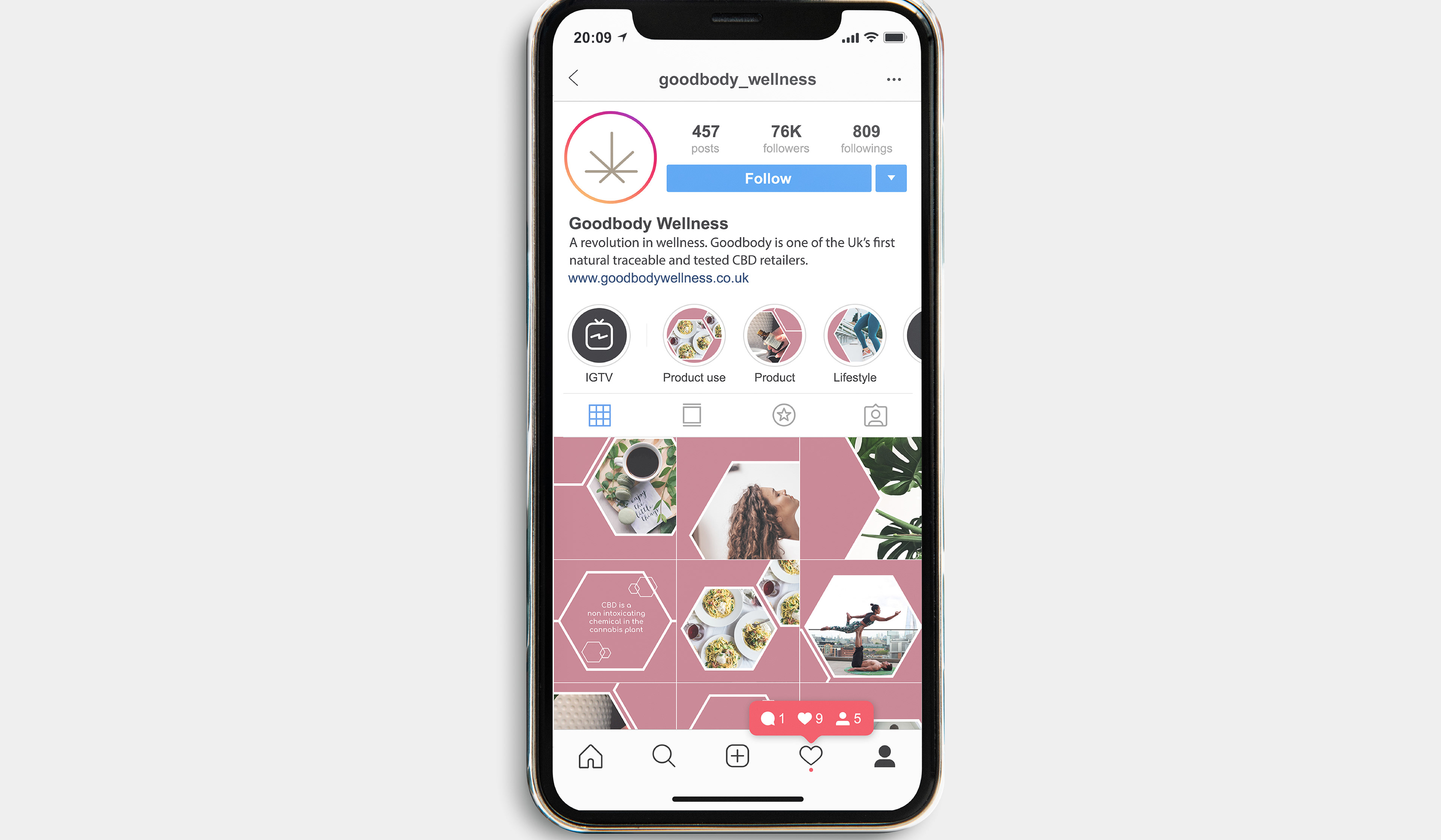
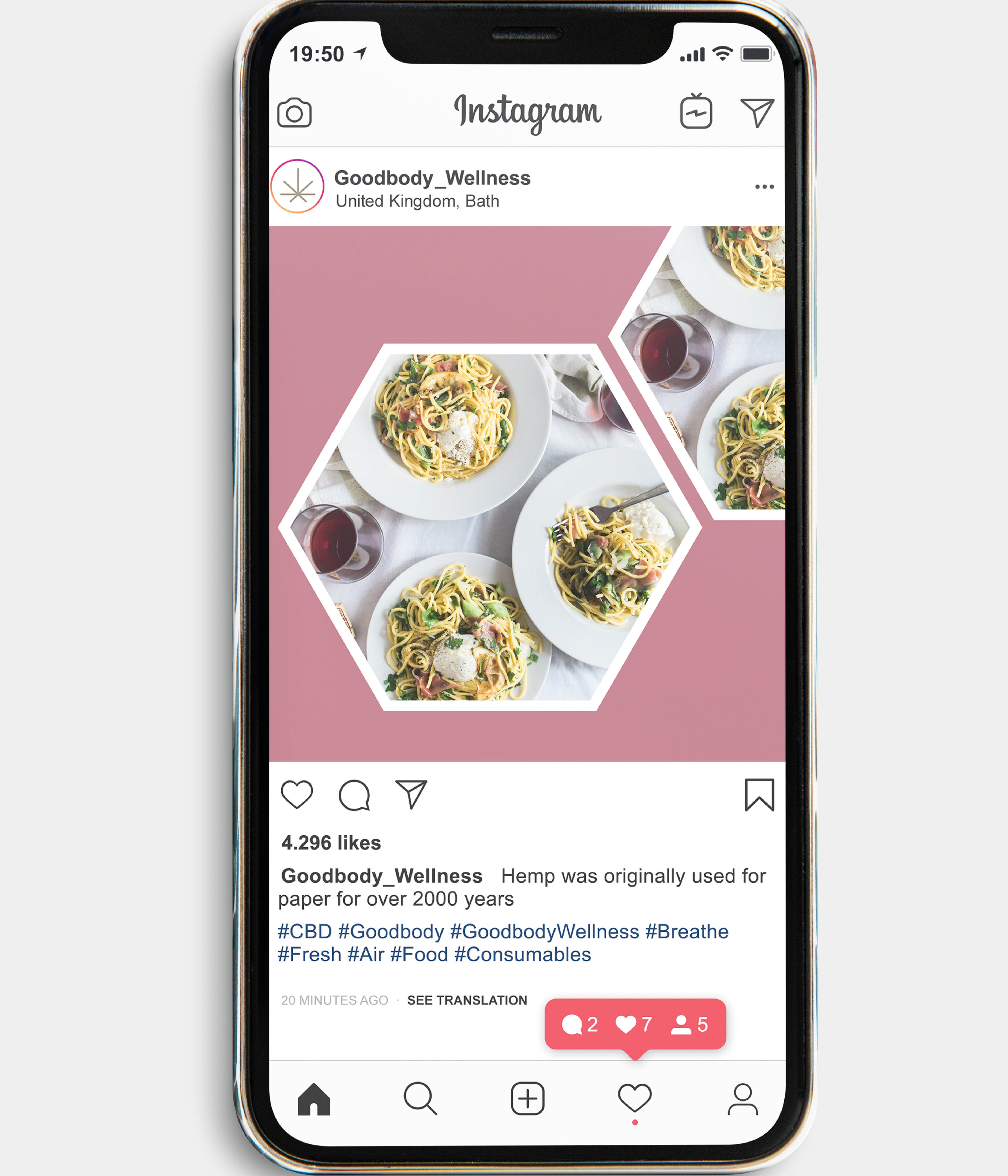

SOCIAL MEDIA CAMPAIGN
Our concept involves a sequence of scheduled posts, utilizing various types such as lifestyle shots, product aesthetics, and views. Emphasizing emotional over physical value, we present products indirectly. For instance, a bath bomb is tagged through a photo of a woman bathing, illustrating the potential feelings it evokes.
Highlighting people is crucial, featuring individuals who inspire our target audience. These posts create curiosity about their lifestyle and product use, encouraging others to explore Goodbody for a potential transformation whilst enhancing brand perception.
Adding a text-based element, "image quote" posts deliver facts from themes like hemp history, cannabinoids, and CBD. These aim to inform a broader audience, sparking interest that may lead to further research on Goodbody.

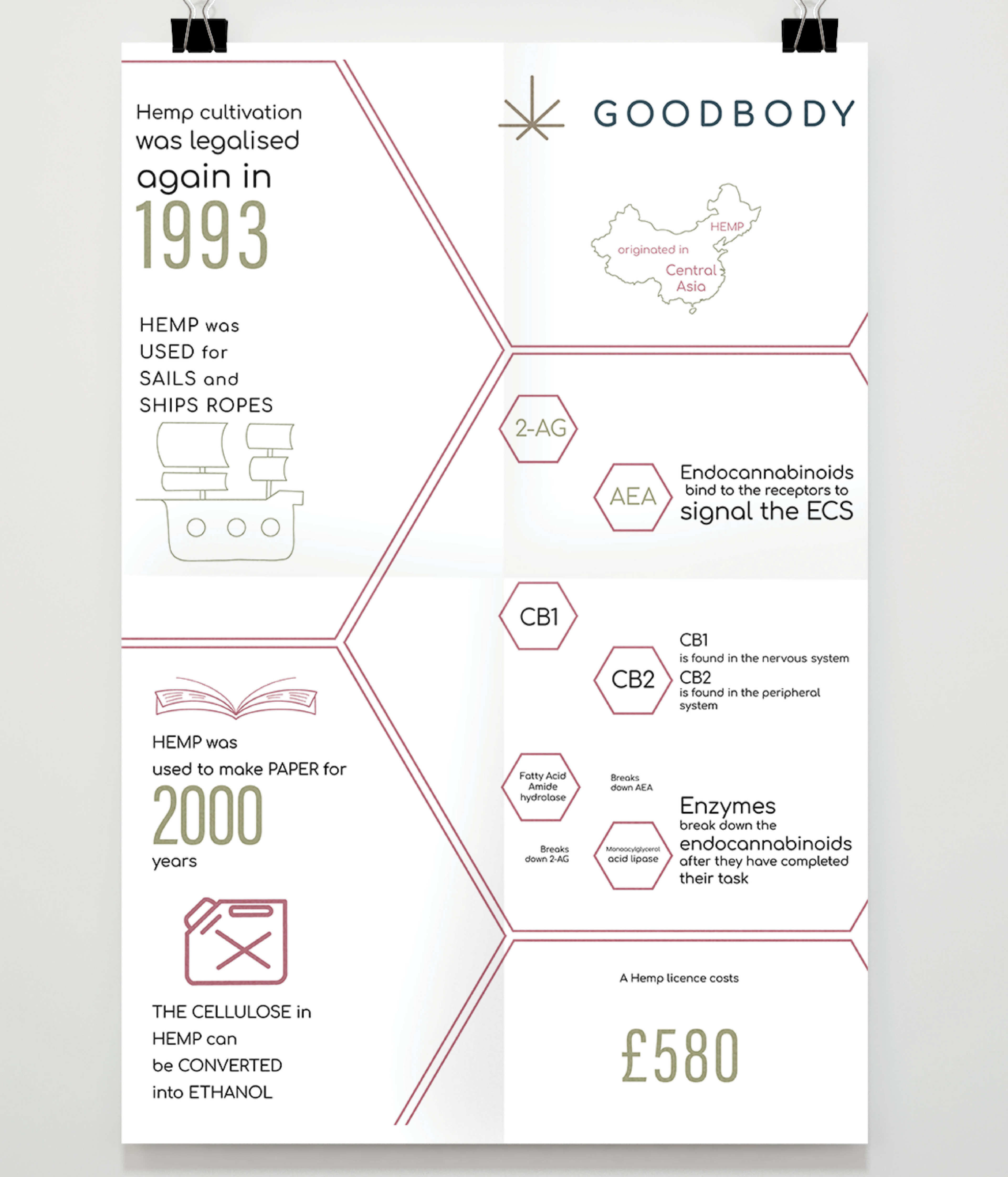
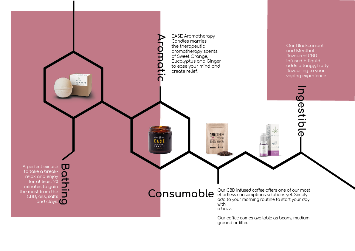
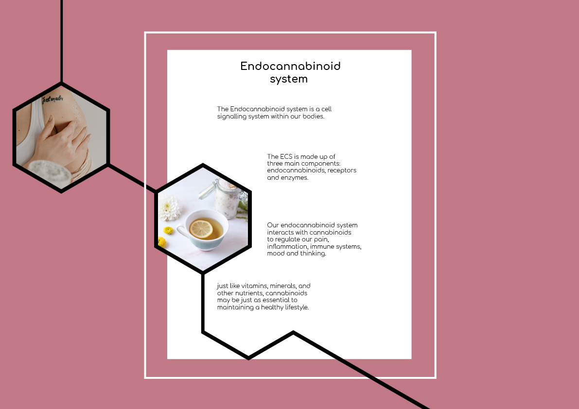
PRINTABLE INFO GRAPHIC
Georgia was in charge of the two large scale info graphics of the project.
Mainly focusing on informing the target audience of educational facts though digitally
crafted line imagery.
Mainly focusing on informing the target audience of educational facts though digitally
crafted line imagery.
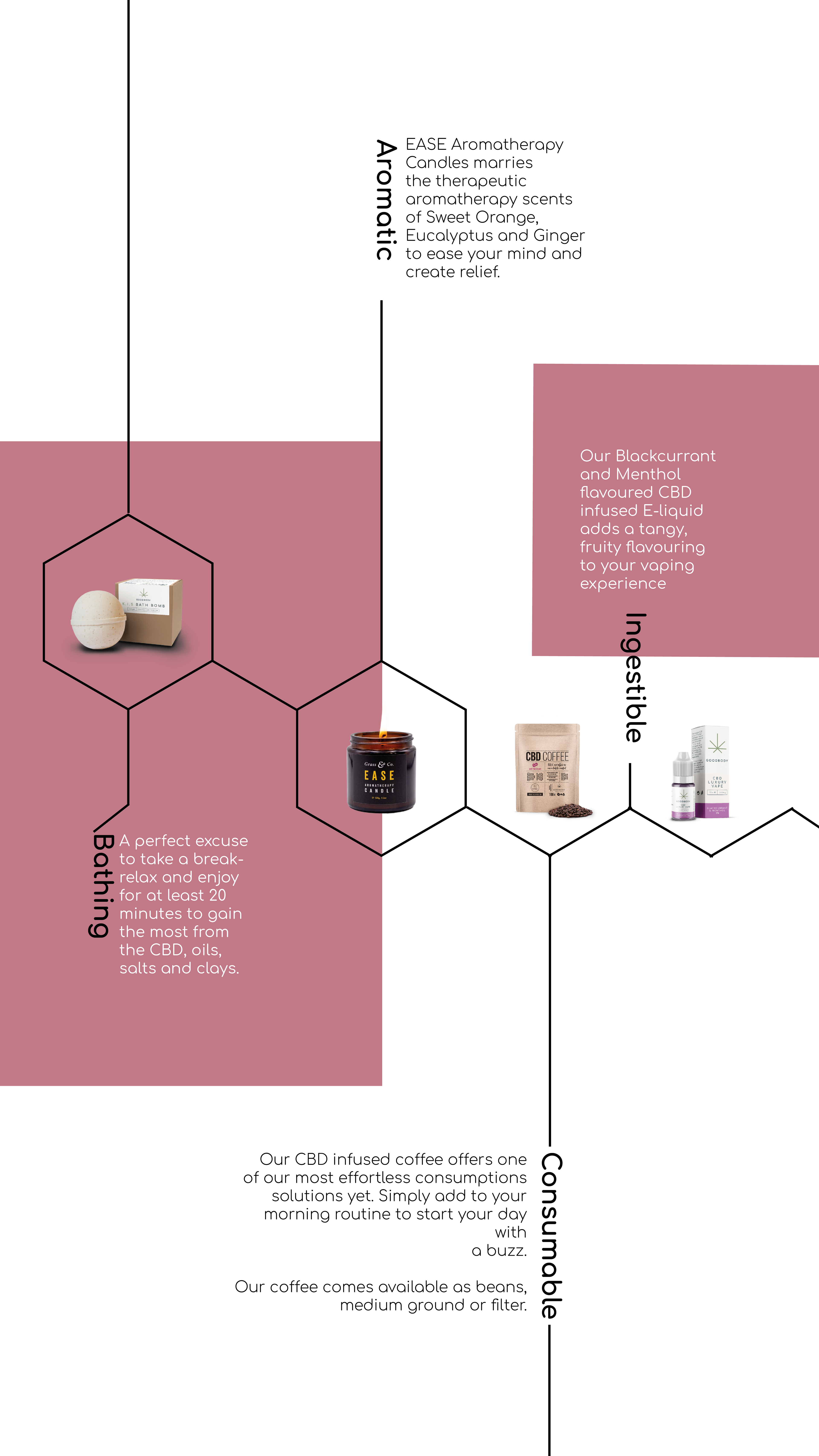
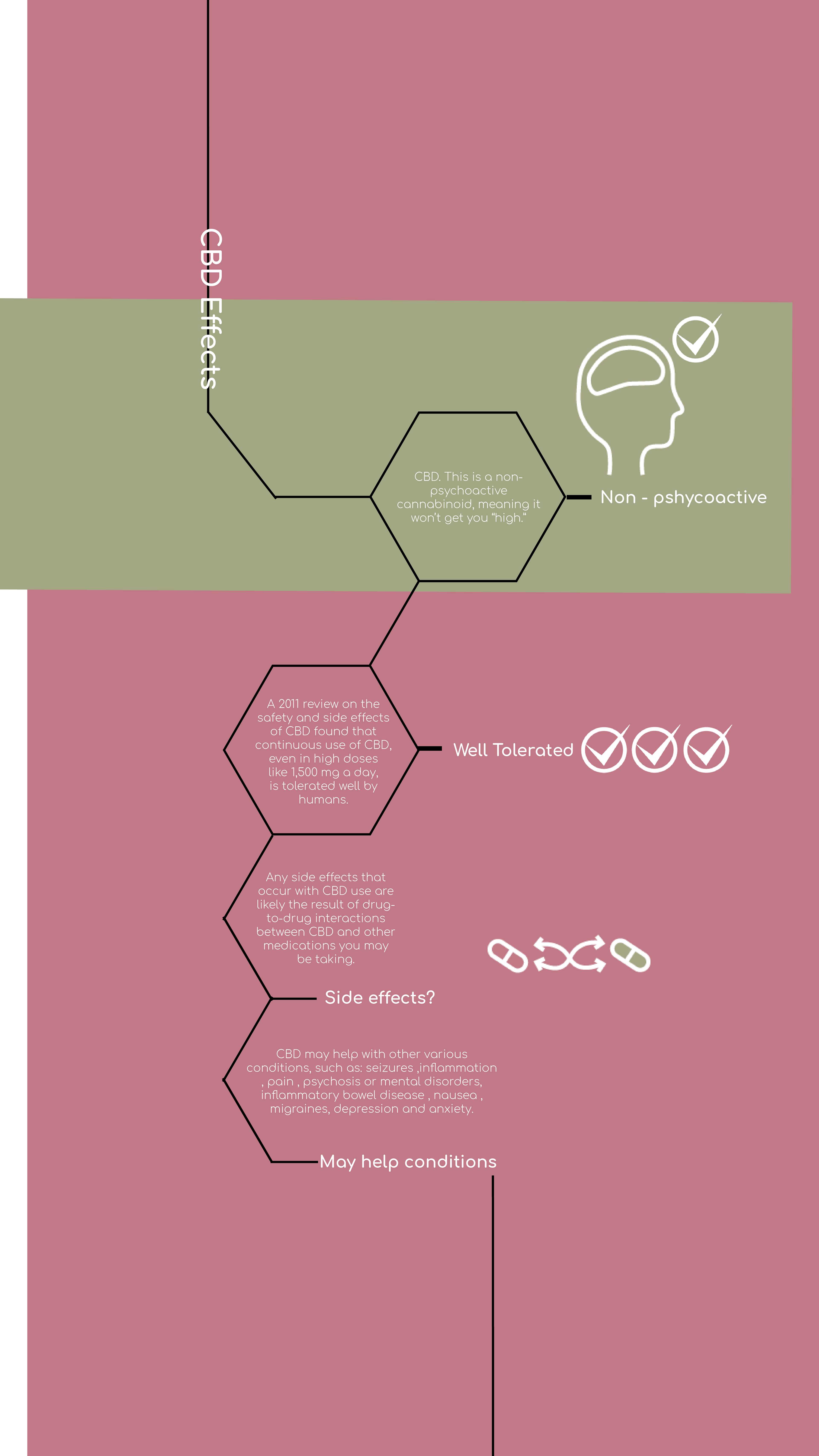
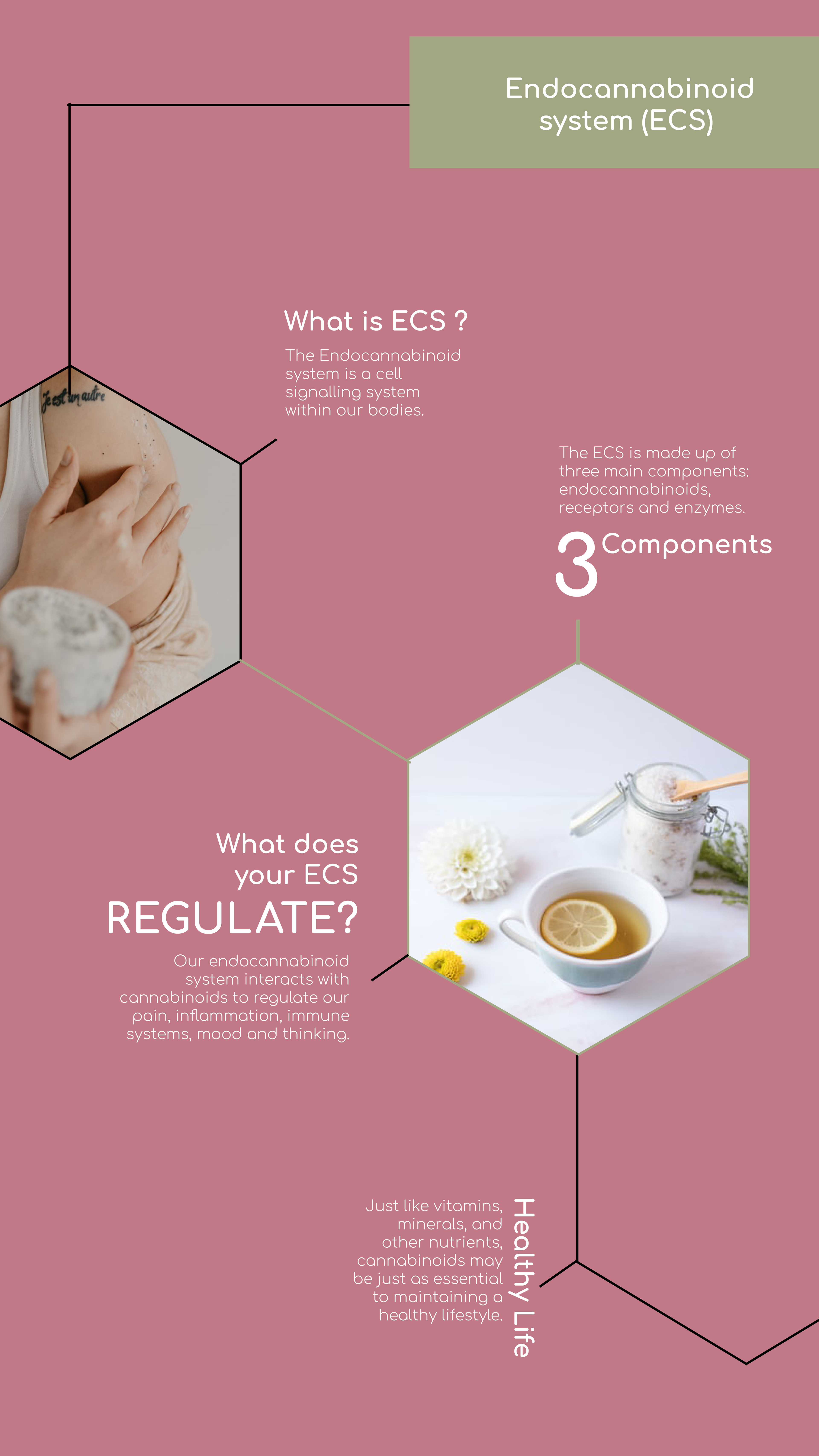
PORTRAIT - VERSION 1


LANDSCAPE - VERSION 2
I opted for version one for reason being social media convenience. In this ever evolving world I thought this would be a great way to stand out when presented in the shops display windows! A slow interactive map educating the street viewer.
BACKGROUND RESEARCH
My research reveals successful companies use diverse posts related to brand attributes, products, lifestyle, people, and recipes, creating an impression through temptation.